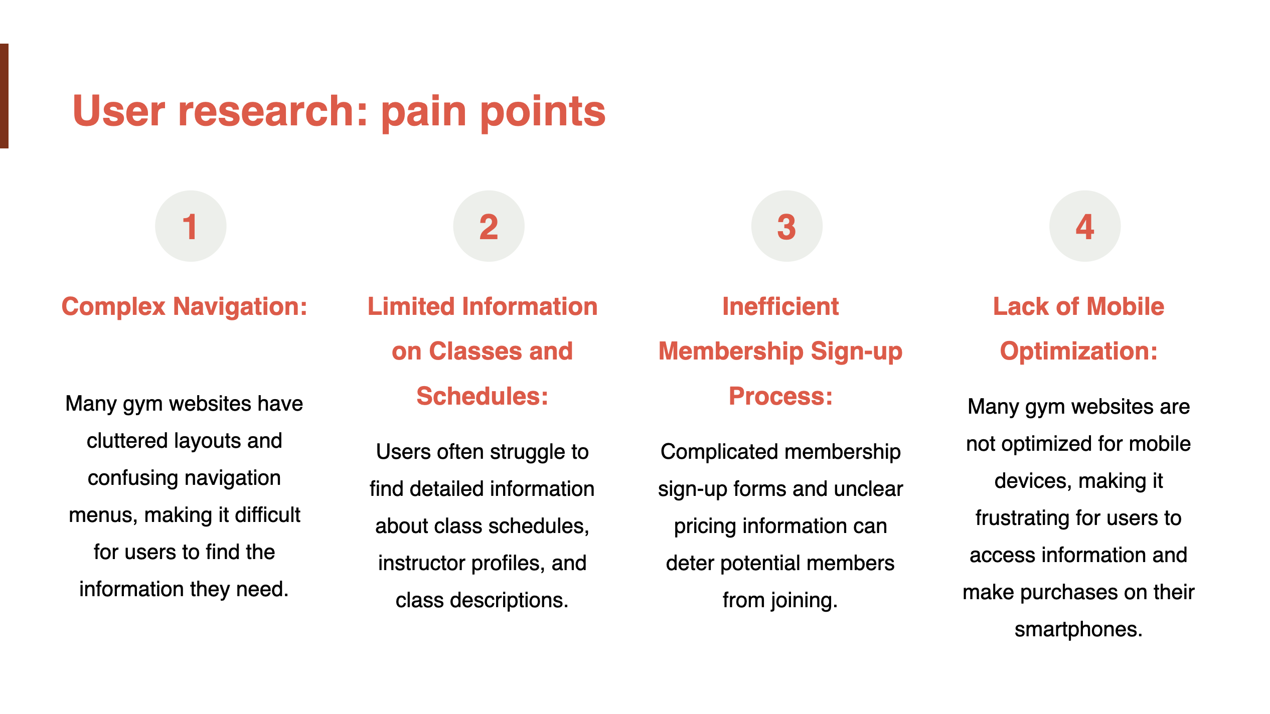
❌ Potential members struggled to find key information online ❌ The absence of an easy membership sign-up process led to drop-offs ❌ Apparel and accessories sales were untapped due to a poor e-commerce experience
More Than a Gym. A Digital Fitness Ecosystem.
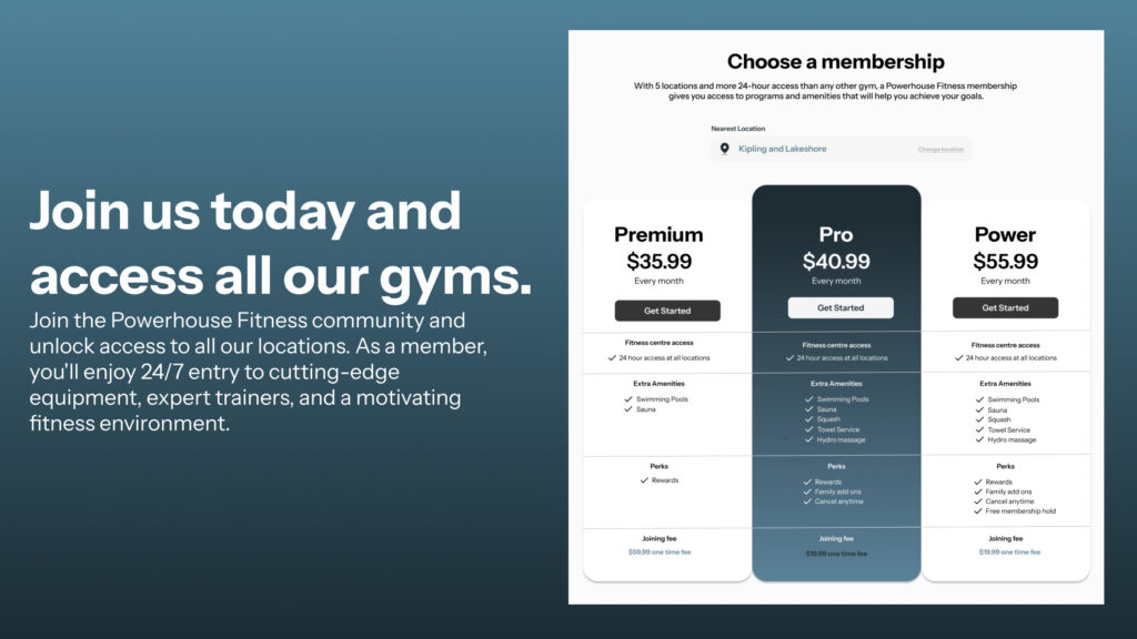
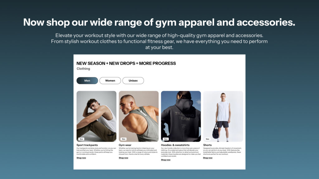
I designed the PowerHouse Fitness website to be more than just an online storefront. It became: ✅ A frictionless membership portal – Sign-up in seconds, not minutes ✅ A seamless e-commerce experience – Gym wear & accessories, just a tap away ✅ An intuitive navigation system – So users always know exactly where to go
User Research: Understanding the Modern Gym-Goer
We interviewed gym goers and fitness enthusiasts to create detailed user personas. These personas will help Powerhouse Fitness design a website that caters to their specific needs and preferences.
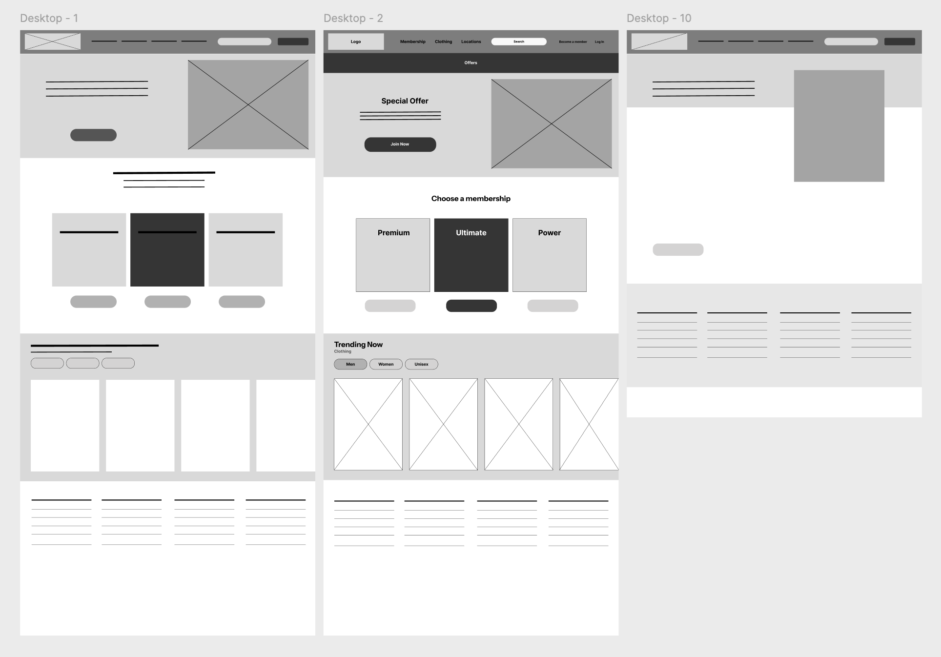
Wireframes
After conducting in-depth user research with gym-goers and fitness enthusiasts, we translated our findings into visual representations known as wireframes. These wireframes outline the basic structure and content hierarchy of the website, providing a blueprint for the user experience. By visualizing the user’s journey from the homepage to the checkout process and considering factors like information architecture and layout effectiveness, we can ensure that the website is intuitive and user-friendly. This iterative process allows us to refine the design and create a website that meets the specific needs of Powerhouse Fitness’s target audience.
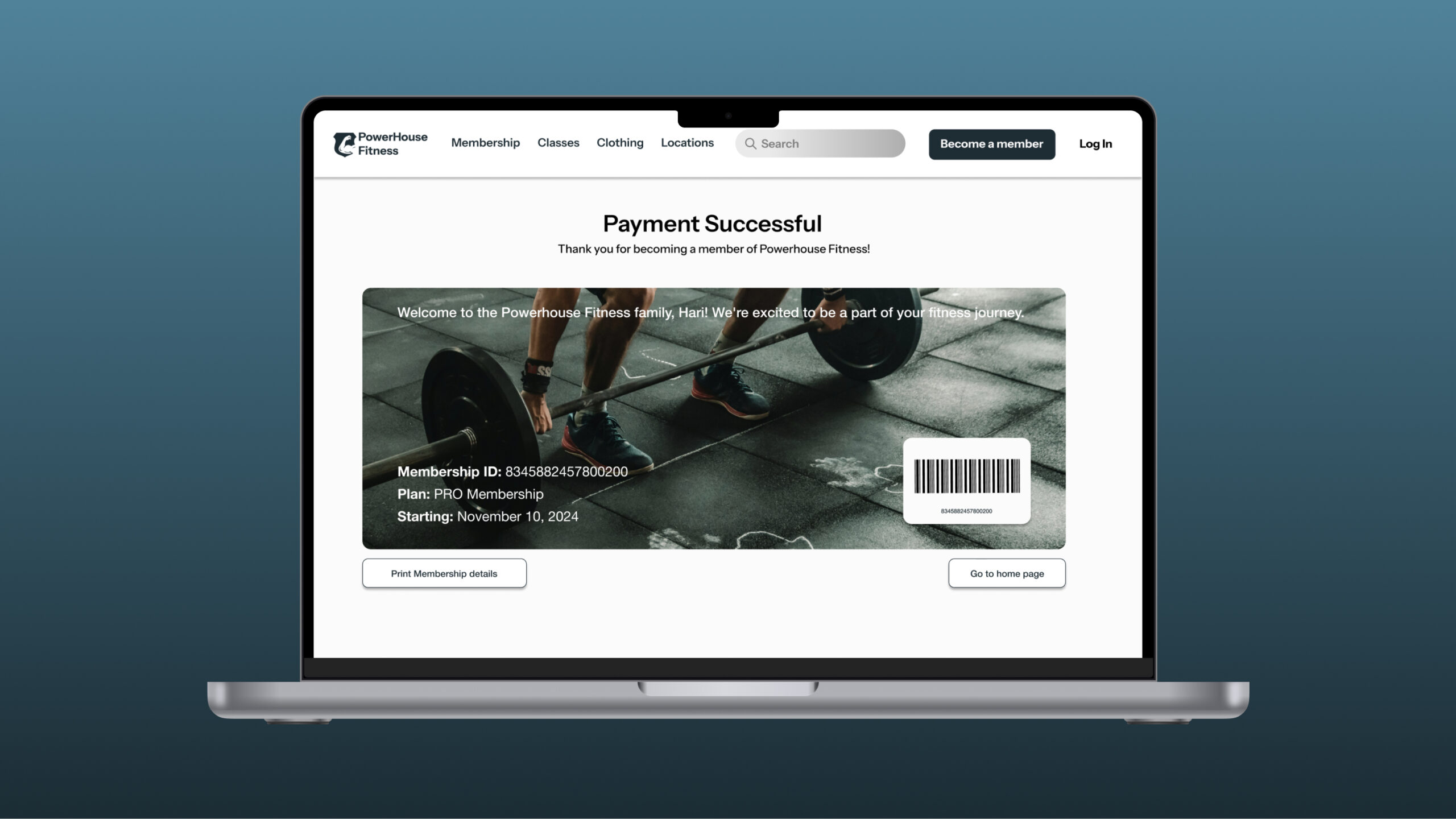
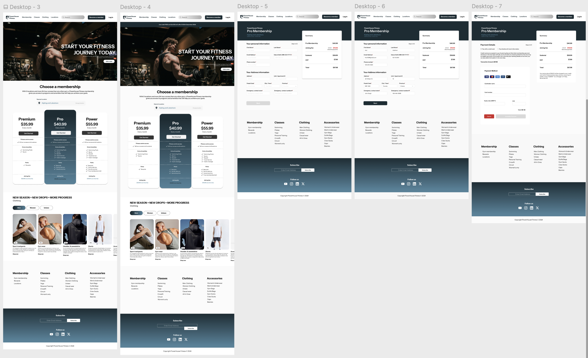
Hi-fi prototype
Once wireframes were validated, I designed high-fidelity prototypes in Figma, focusing on:
Brand-consistent visuals that aligned with PowerHouse’s energy Intuitive layouts ensuring users could find what they needed in seconds Engaging interactions making navigation feel smooth and natural
Usability Study
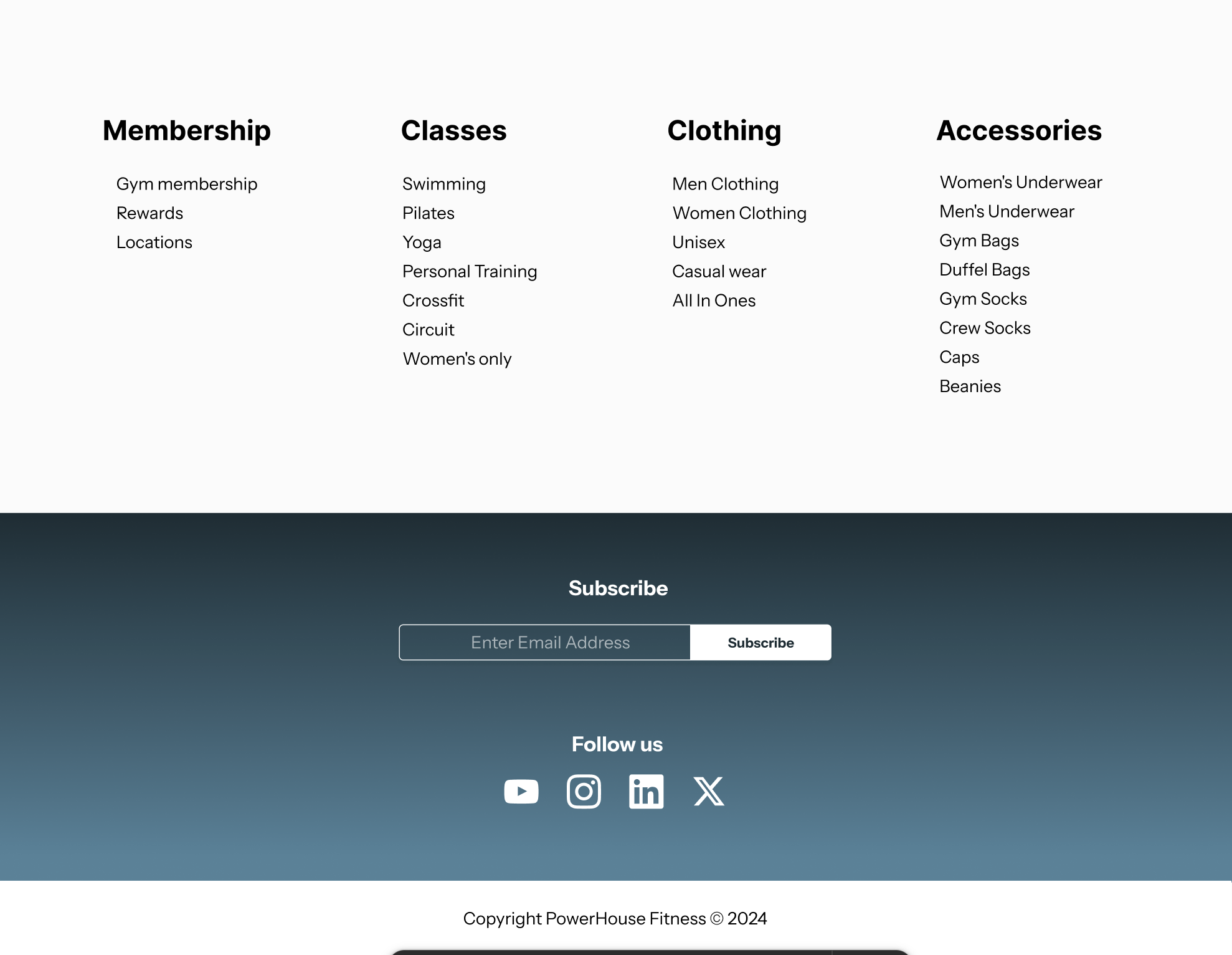
We conducted a usability study and discovered that users were having difficulty navigating to specific pages on the website. To address this issue, we added a prominent navigation block that clearly outlines the various sections of the website, including Membership, Clothing, Accessories, and Classes. This improvement enhances user experience by providing easy access to desired information.
✅ More prominent navigation elements for faster page access ✅ Improved product categorization to enhance the shopping experience ✅ Simplified checkout process reducing friction in transactions
Major Design Iterations
We iterated on our design based on the insights gained from the usability study. By incorporating the feedback and suggestions, we made necessary changes to improve the user experience. This iterative process ensures that the final product meets the needs and expectations of our users.
What I Learned & What’s Next
This project reinforced a key lesson: a website should do more than look good—it should work hard for the business.
By applying UX research, usability testing, and iterative design thinking, we turned PowerHouse Fitness’s digital presence into a conversion-driven, user-centric platform.
Next? I’m excited to continue designing seamless digital experiences that bridge the gap between business goals and user needs.