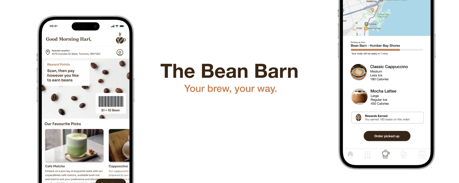
Bean Barn Digital Upgrade: Enhancing Usability, Engagement & Loyalty
The Challenge: Turning Frustration into Delight
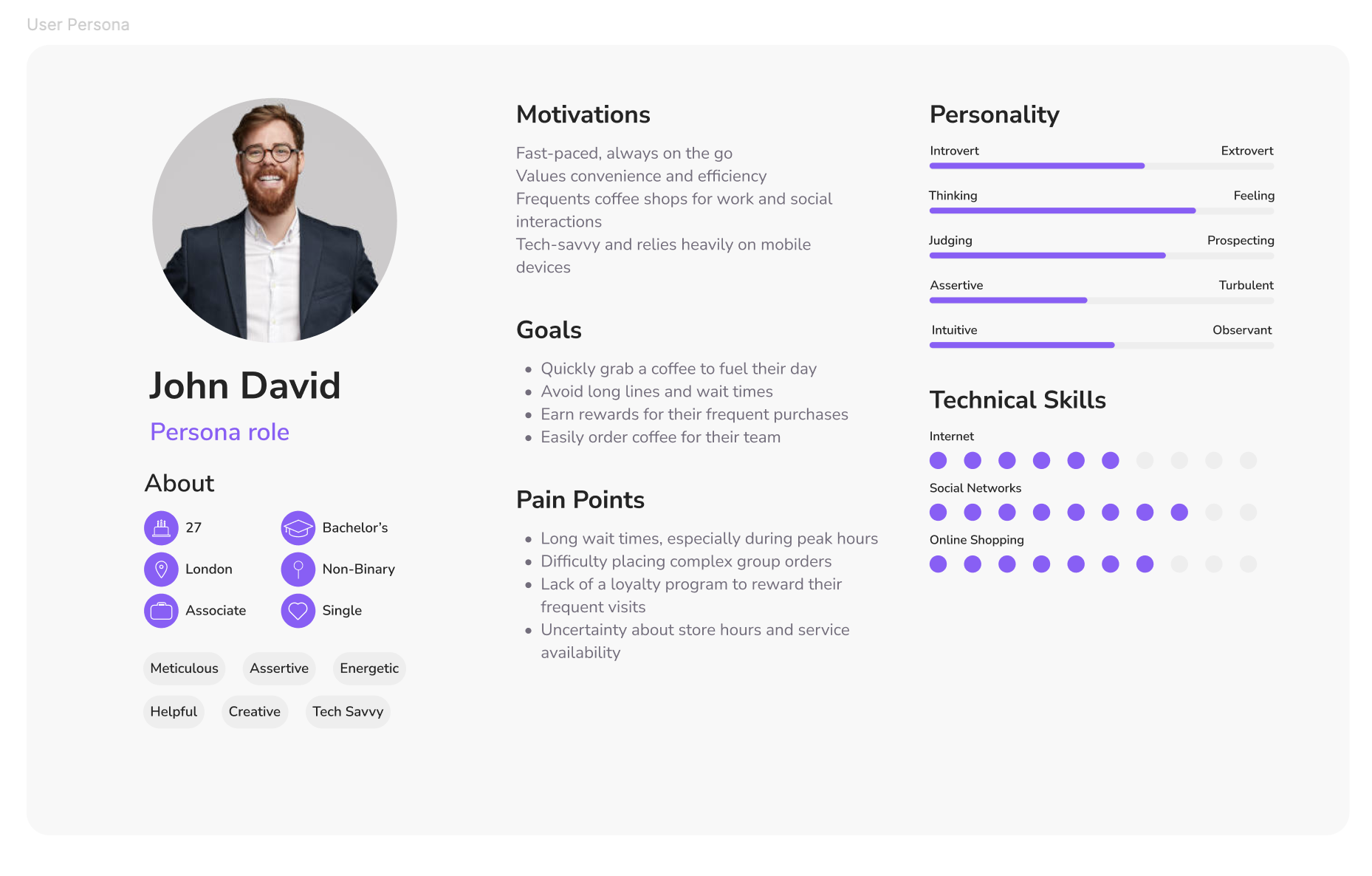
For Bean Barn customers, ordering their favorite brew often meant long wait times and no way to earn rewards for their loyalty. Some, like John—a daily visitor—would even skip his coffee to avoid the hassle.
I saw an opportunity
What if we could design a frictionless digital experience that not only saved time but also rewarded loyalty?
The Breakthrough: A Coffee Experience, Reimagined
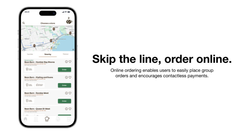
Partnering with Bean Barn’s team, I led the end-to-end design of a mobile app that: ✅ Enabled seamless mobile ordering, reducing wait times by 40% ✅ Introduced a smart rewards program, increasing repeat orders ✅ Created a visually engaging, intuitive interface, making ordering effortless
User Research
Understanding the Customer: What Truly Matters?
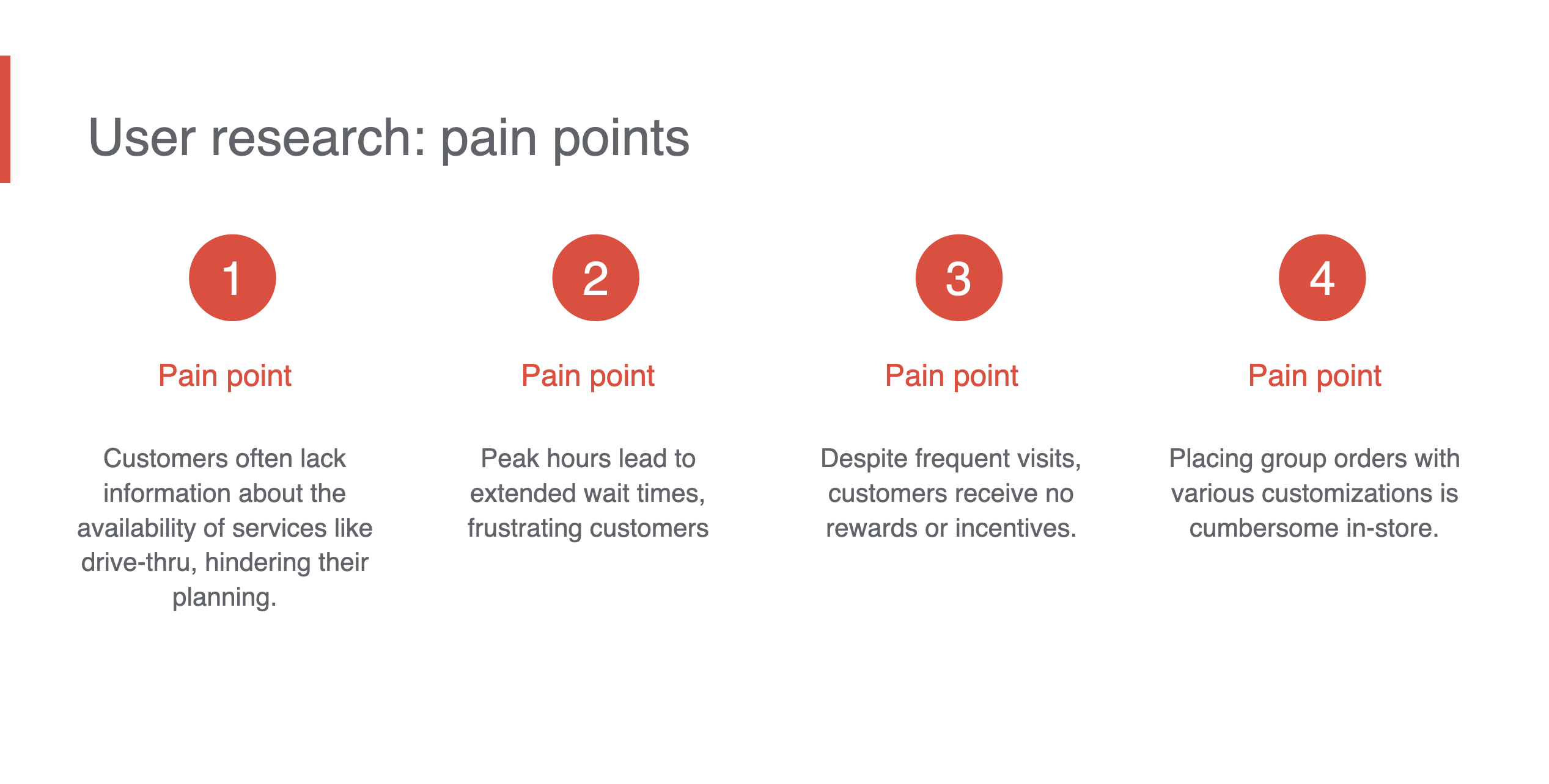
To craft a solution that resonated, I conducted user research with 5 participants, uncovering key pain points:
“The wait times are too long!”– Customers were often in a rush and couldn’t afford to stand in line.
“I wish I could earn points like other coffee chains.” – Lack of a loyalty program made customers feel undervalued.
These insights shaped our strategy—we needed an app that delivered speed, convenience, and value.
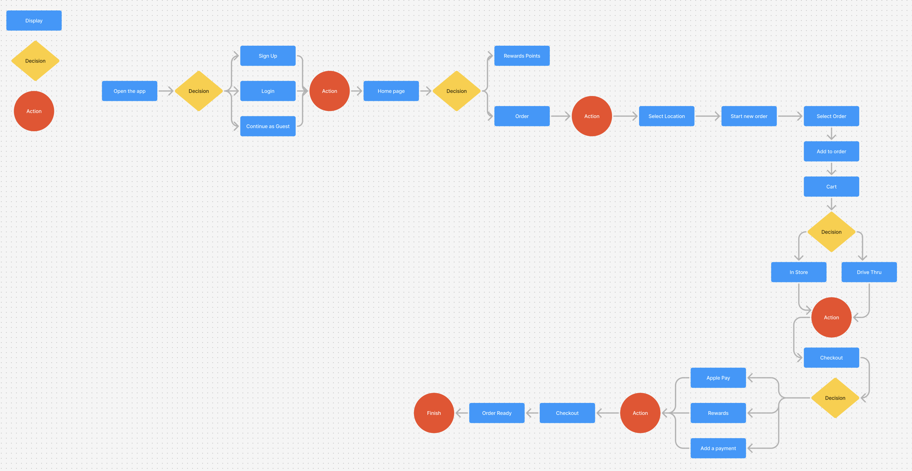
User Flow
This visual representation depicts the user’s step-by-step interaction with the app, from initial launch to final order placement.
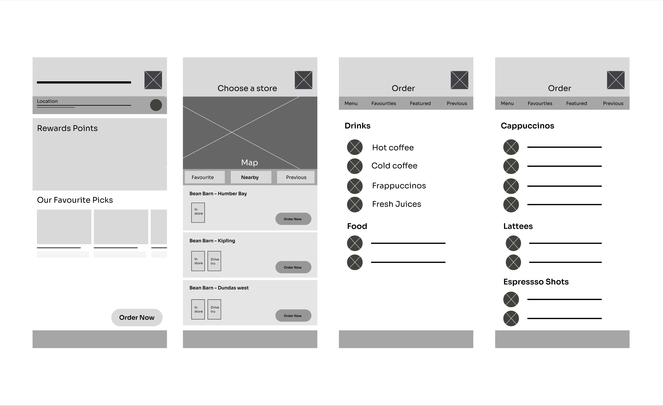
Wireframes
Following the ideation phase, I transformed the concept into an interactive, low-fidelity digital prototype. This prototype was then tested with five potential users to gather valuable feedback and refine the design.
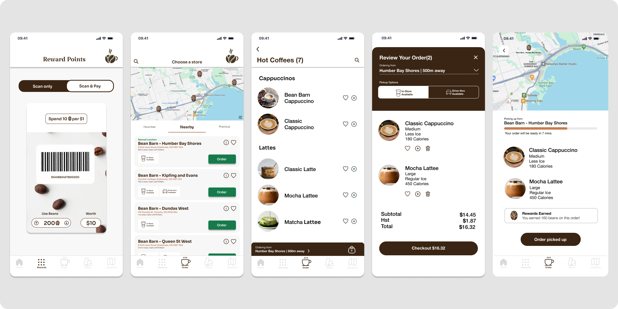
Hi-fi prototype
The low-fidelity prototype was then refined and transformed into a high-fidelity prototype using Figma. This high-fidelity prototype provides a detailed visual representation of the app’s interface and user experience.
Usability Study
After conducting a usability study, we identified the following key areas for improvement:
Limited Order History:The current system lacks a feature to easily access and reorder past orders or previous locations. This inconvenience can significantly increase the time and effort required for users to place new orders.
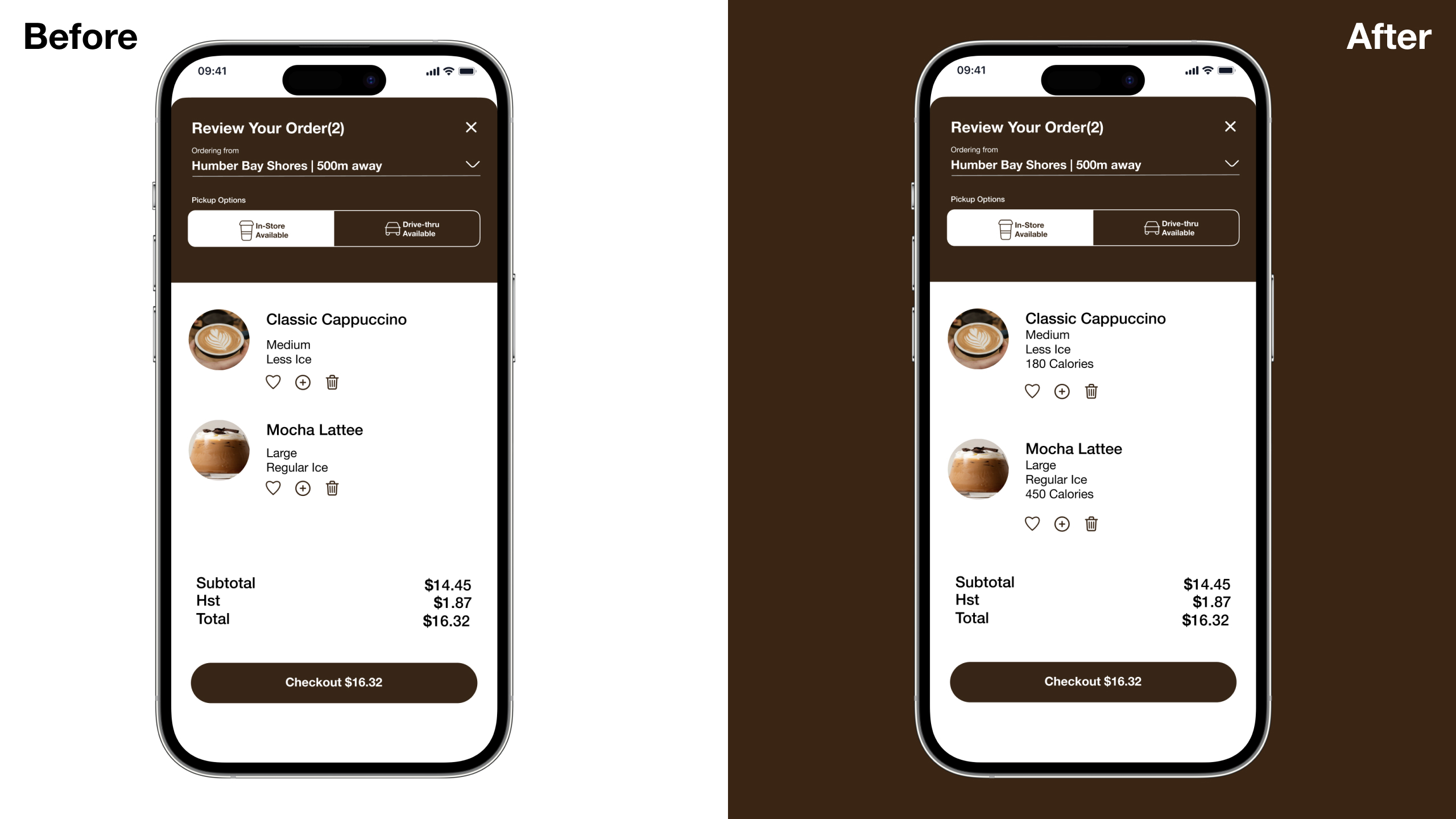
Missing Nutritional Information:The lack of calorie information for beverages hinders informed decision-making for health-conscious consumers. Providing this information would empower users to make choices that align with their dietary preferences and goals.
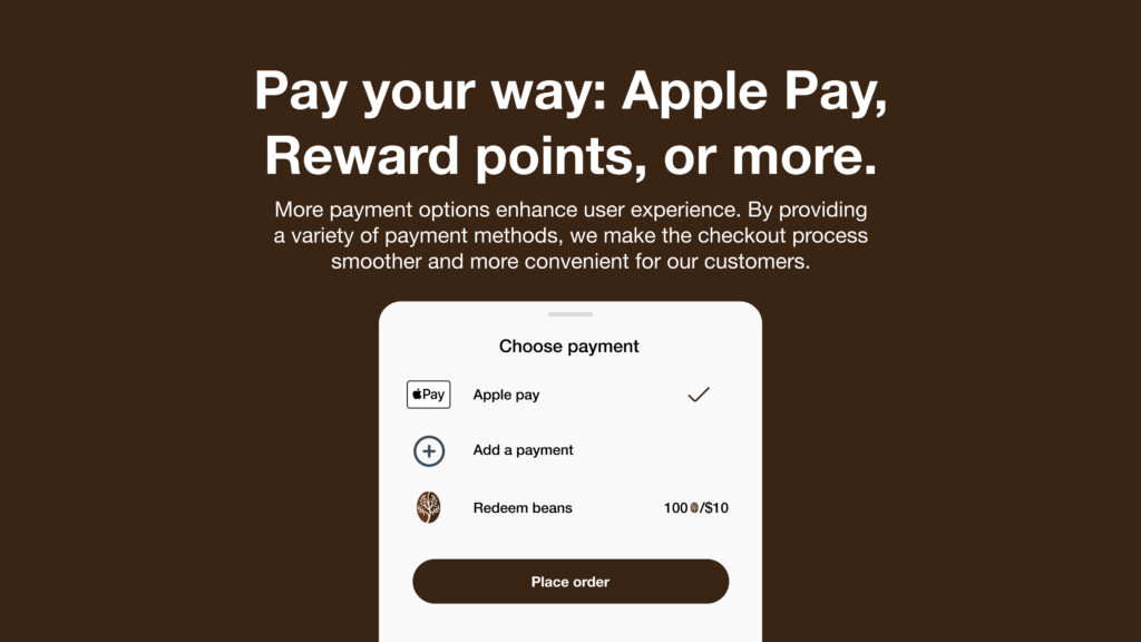
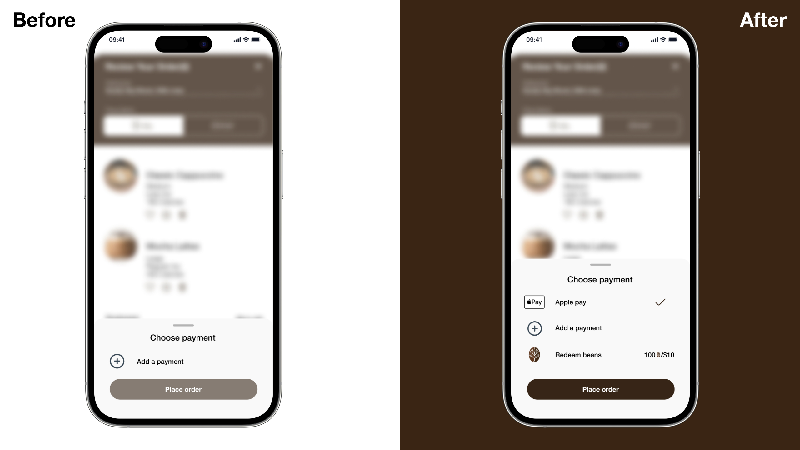
Limited Payment Options: The absence of Apple Pay as a payment option restricts user choice and convenience. This limitation may deter some users from completing purchases, particularly those who prefer contactless and secure payment methods.
From Testing to Perfection: Iterating for Excellence
✅ Apple Pay integration for faster, frictionless checkout ✅ Nutritional information to help health-conscious users make informed choices ✅ Reorder history feature to simplify repeat purchases
With each iteration, we moved closer to an experience that wasn’t just functional—it was delightful.
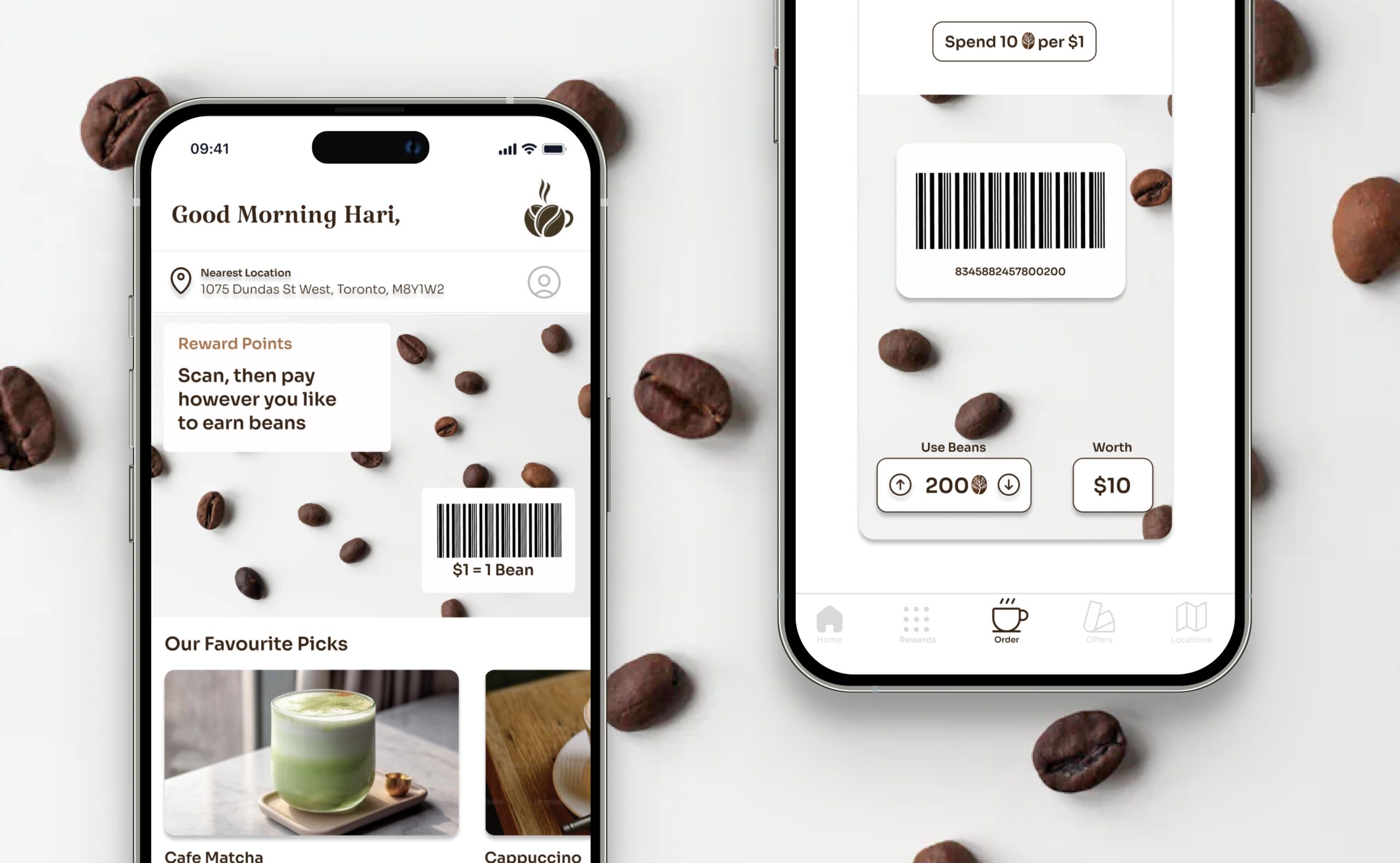
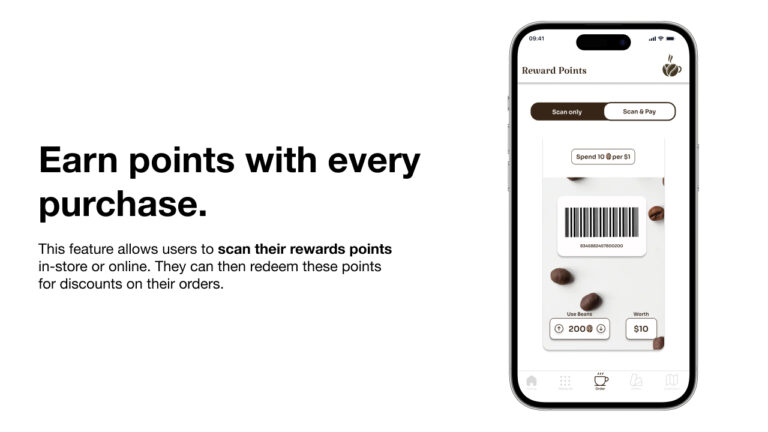
Payment Options:To enhance user convenience, we integrated Apple Pay and a rewards redemption feature into the payment process.
Nutritional Information:To cater to health-conscious consumers, we added calorie counts to the checkout process, empowering users to make informed beverage choices.
What I Learned & What’s Next
This project reinforced a powerful lesson: Great design isn’t just about aesthetics—it’s about solving real-world problems.
By combining human-centered research, thoughtful UX design, and iterative testing, we transformed a frustrating process into a seamless, engaging experience.
Next? I’m excited to bring this problem-solving mindset to new challenges—designing intuitive, high-impact digital experiences that truly make a difference.