Effortless Food Expiry Management: Reducing Waste with Smart UI/UX Design
The Challenge: Solving the “Forgotten Food” Problem
You open the fridge and find a carton of milk—expired. A pack of spinach—wilted. The groceries you once bought with good intentions now heading straight to the trash.
For many, food waste isn’t intentional—it’s a result of poor tracking. Forgotten items, missed expiration dates, and last-minute grocery shopping lead to unnecessary waste, costing money and harming the environment.
The Solution: A Food Tracking System That Works for You
I designed an intuitive mobile app that helps users:
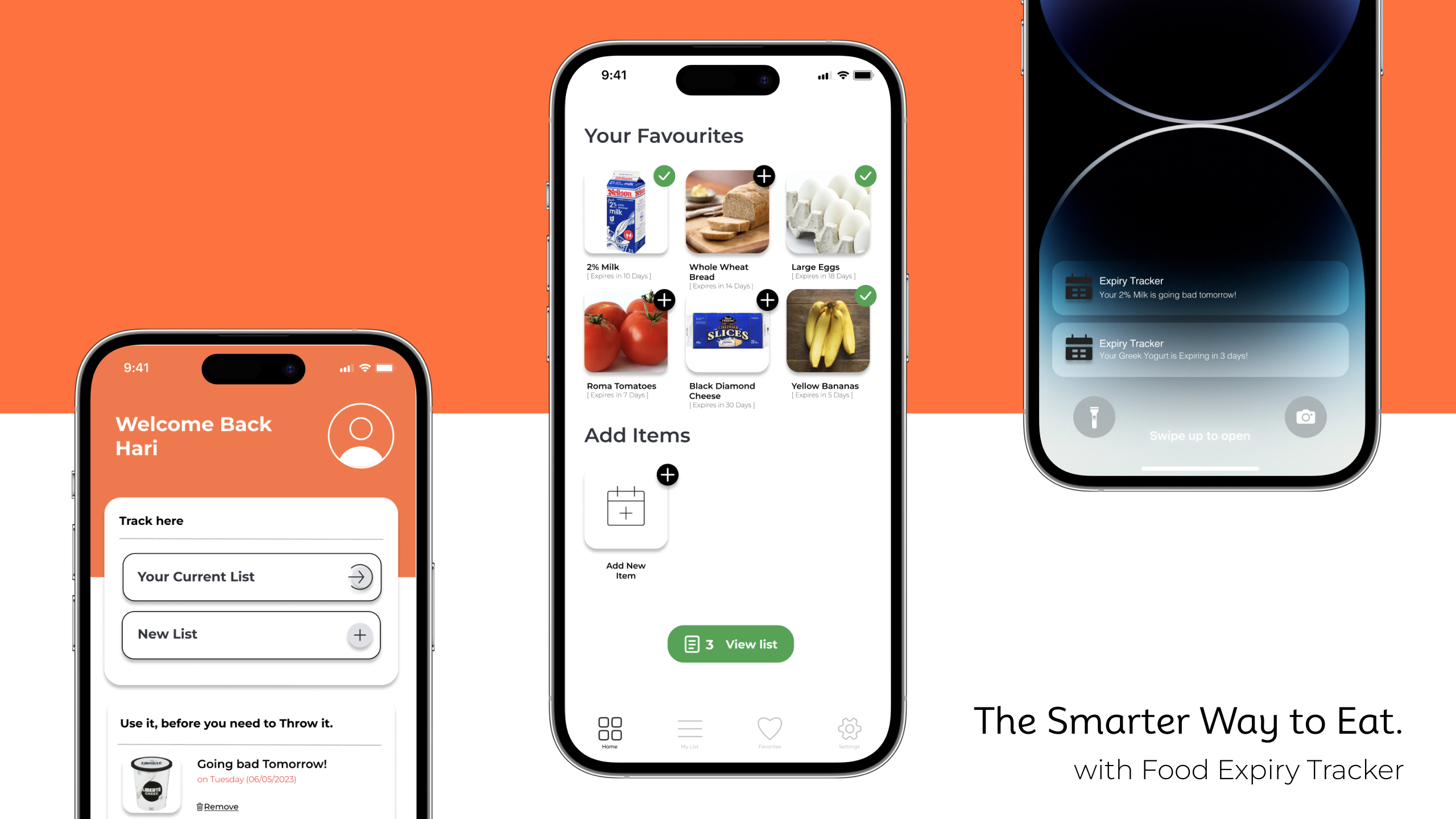
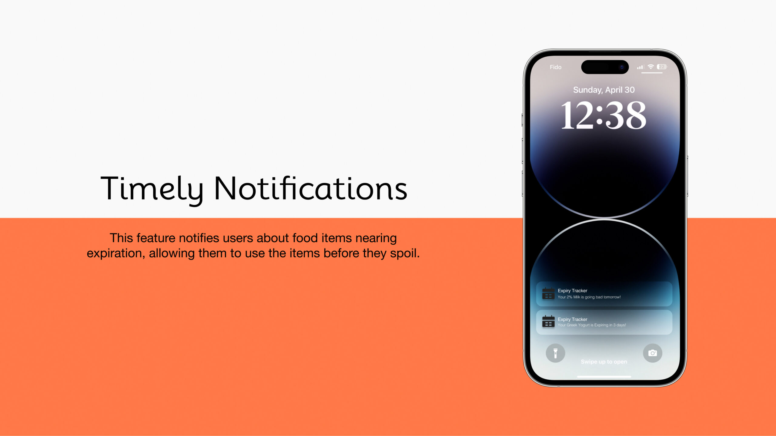
✅ Log food items with ease – Add expiration dates in seconds ✅ Receive timely reminders – Never let food go to waste again ✅ Make smarter grocery decisions – Reduce waste, save money
This wasn’t just an app—it was a step toward a more sustainable and organized lifestyle.
Understanding the User: Why Do We Waste Food?
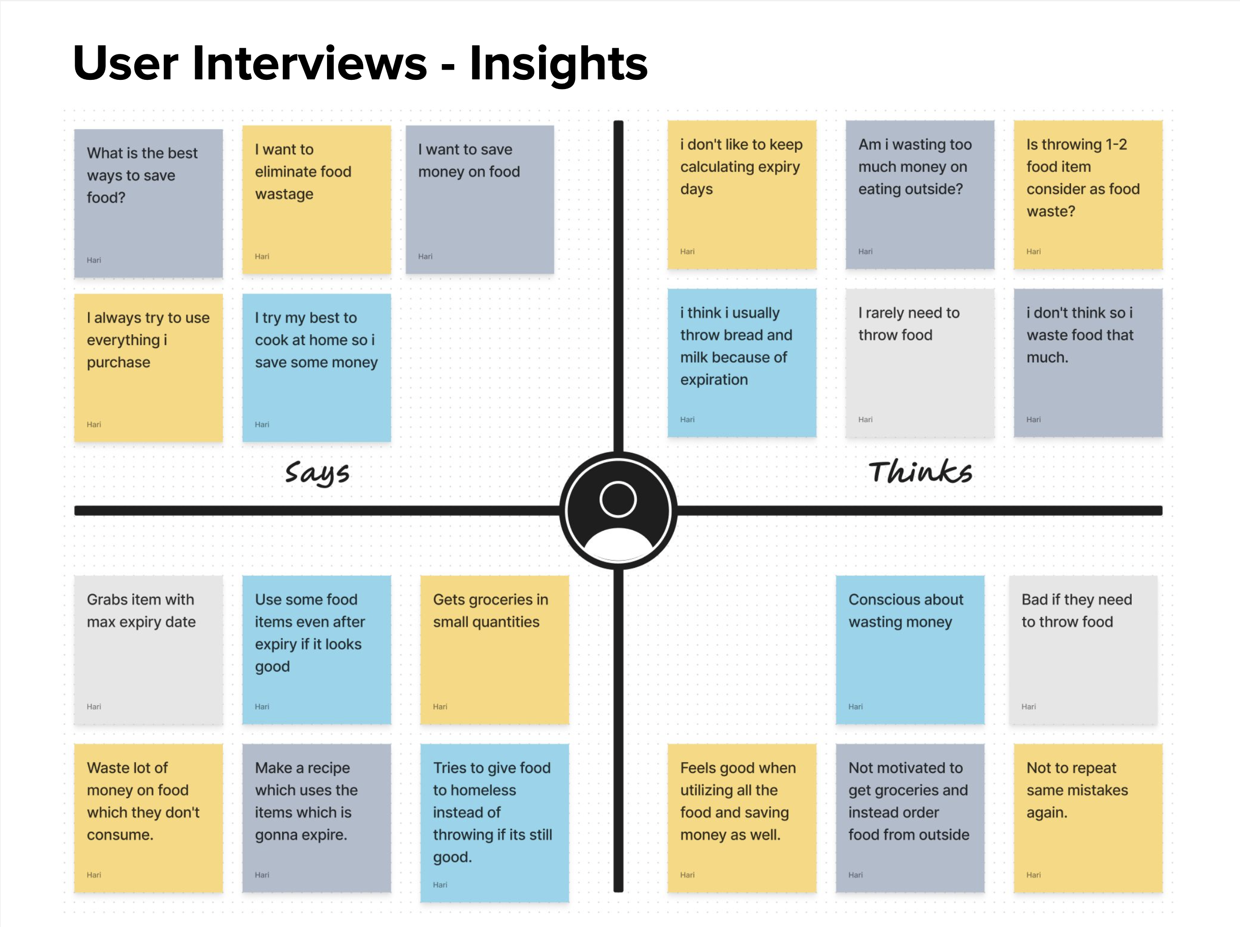
To create a solution that truly solves a problem, I conducted user interviews with five individuals to understand their struggles. Key insights emerged:
“I buy fresh food but forget to use it in time.” – Lack of tracking leads to frequent waste.
“I wish there was a way to quickly add common items.” – Manually entering every item was tedious.
These findings shaped our product direction: the app needed to be fast, intuitive, and proactive in helping users stay on top of their food inventory.
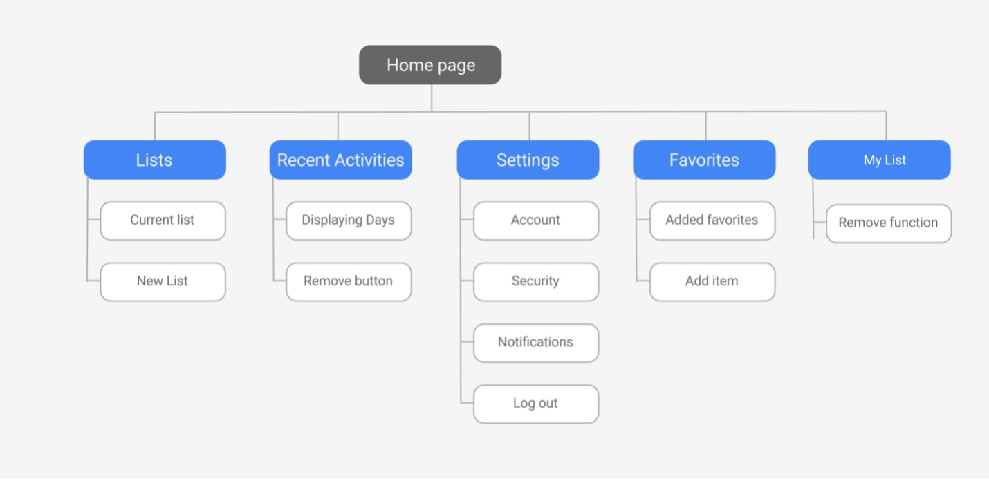
Information Architecture
We then structured the app’s information architecture to ensure a seamless user experience. This involved organizing the app’s features and content logically and intuitively.
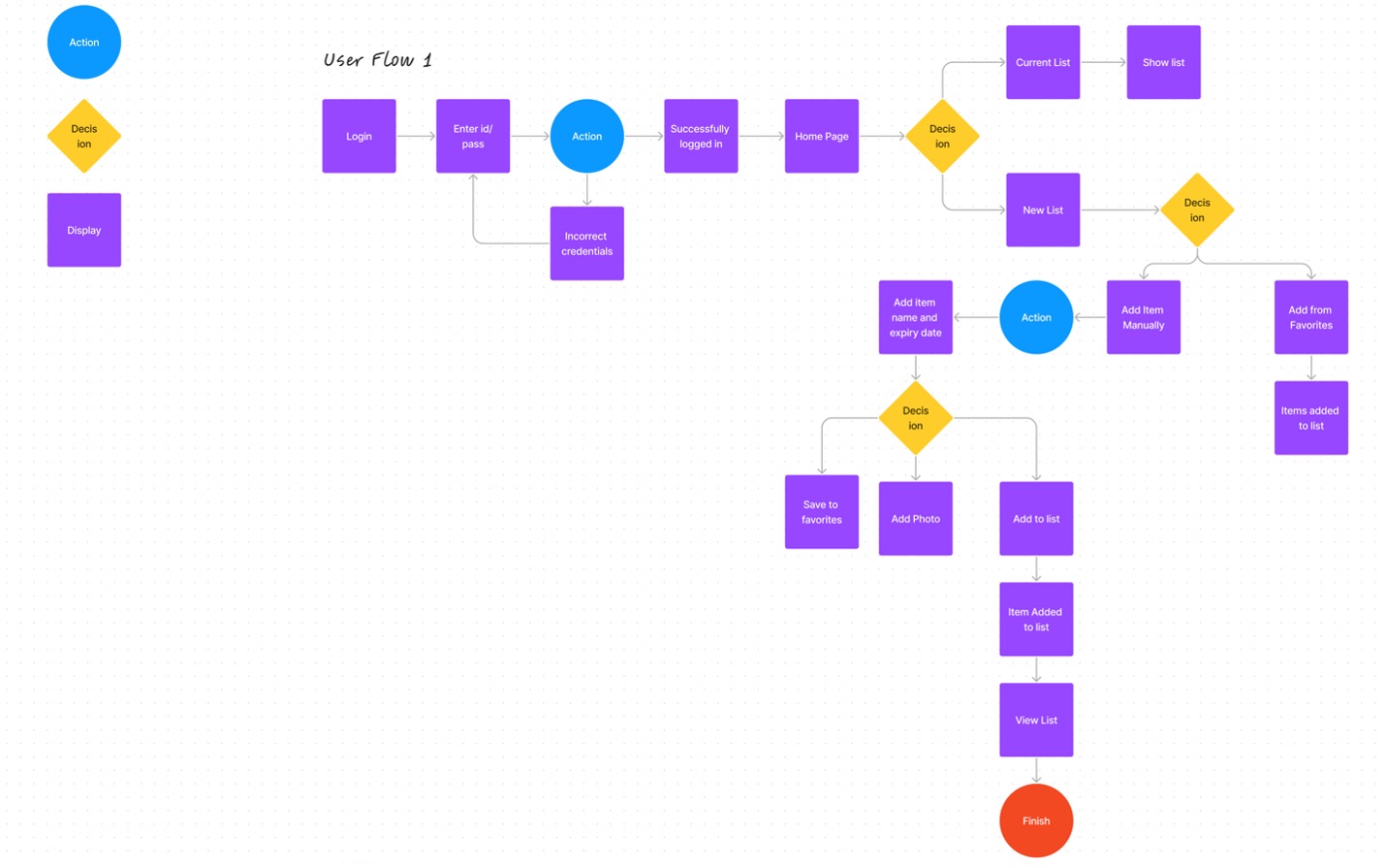
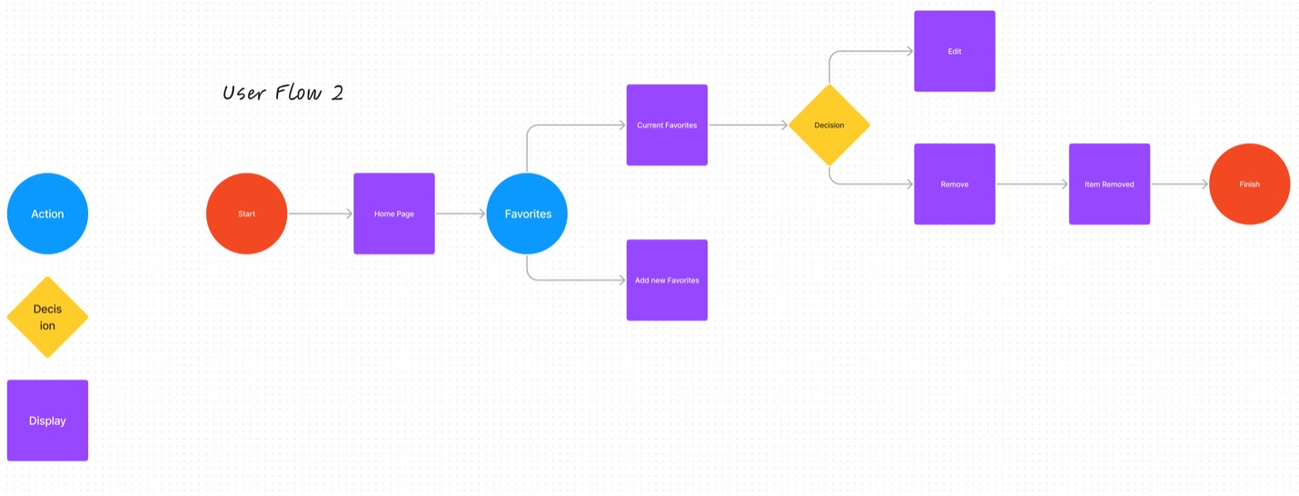
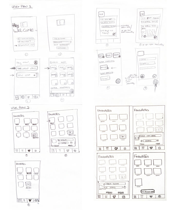
User Flow
We created detailed user flows to visualize the user’s journey within the app. This included mapping out the steps involved in tasks such as launching the app, adding food items with expiration dates, and receiving timely notifications.
Sketches
We began the design process by sketching out initial concepts for the app’s interface on paper. These early sketches helped us visualize the app’s layout and user flow.
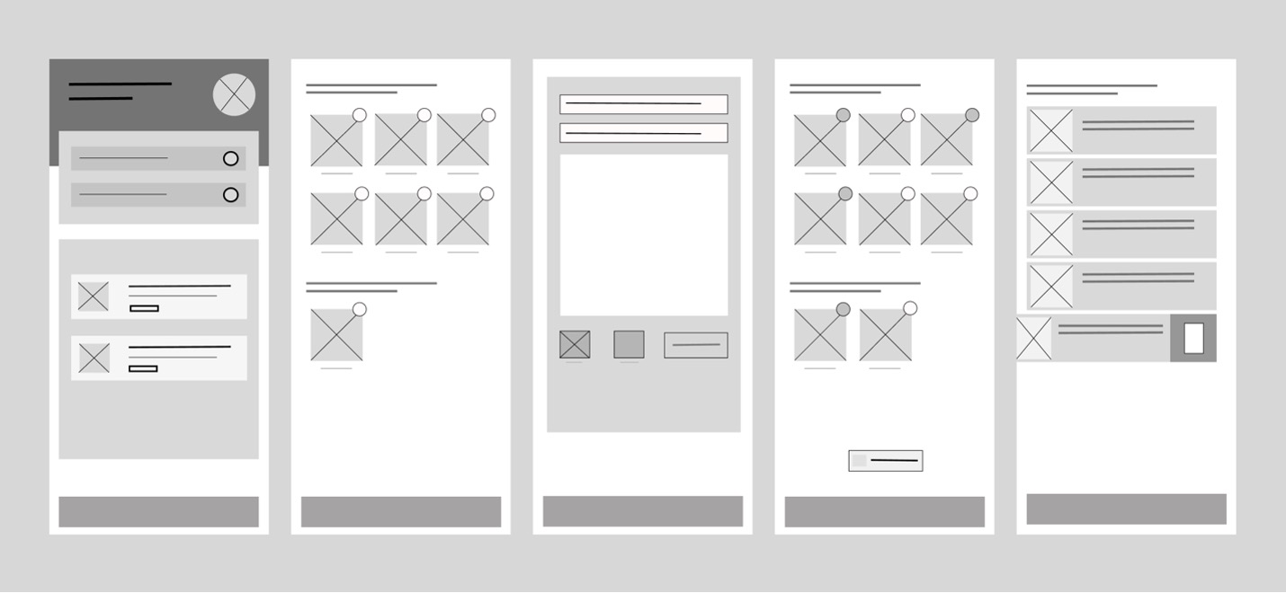
Wireframes
We created wireframes to visualize the app’s layout, information hierarchy, and user flow. These wireframes served as a blueprint for the subsequent UI design phase.
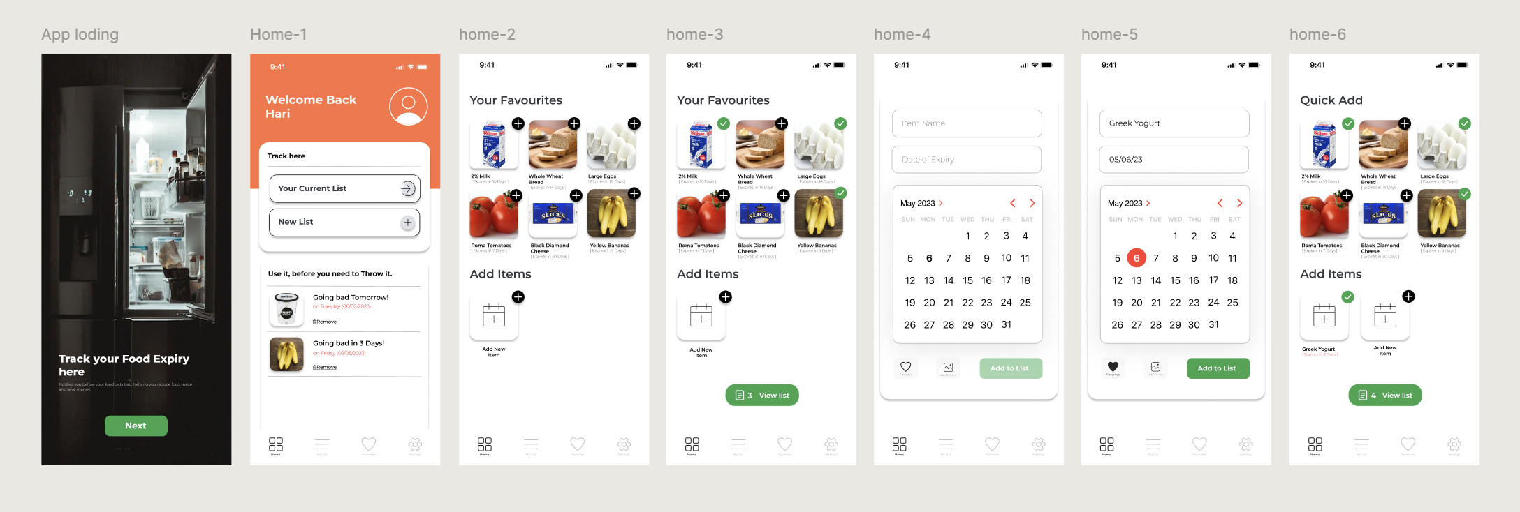
Bringing the Experience to Life: Hi-fi prototype
We then transformed the wireframes into high-fidelity designs using Figma. These designs incorporated a more vibrant color palette and refined user interface elements, resulting in a visually appealing and user-friendly app.
Usability Study
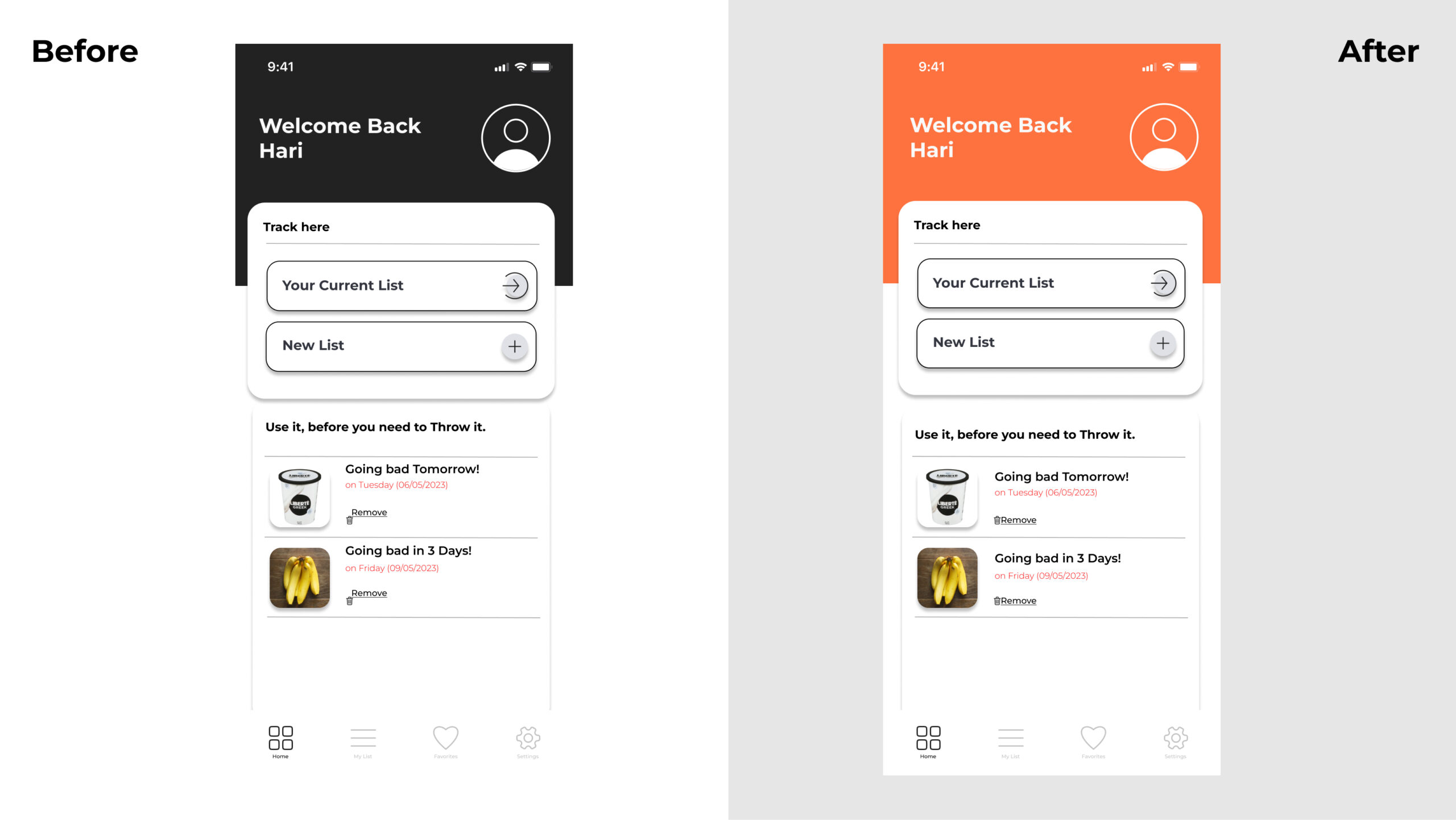
Our usability study revealed two primary areas for improvement:
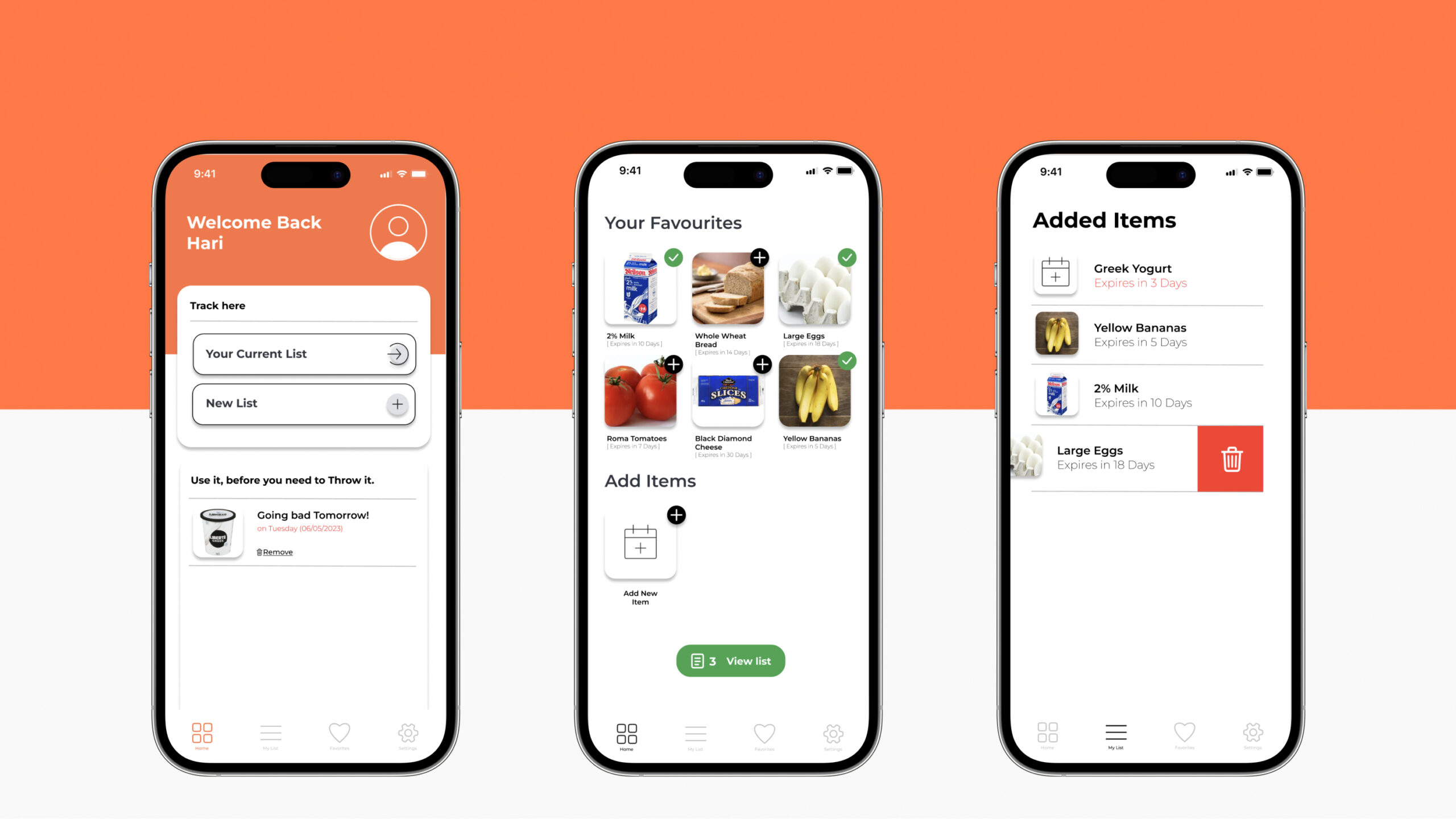
Visual Design:The current dark colour scheme of the app doesn’t align with its purpose as a food tracker. A brighter, more playful colour palette would create a more inviting and user-friendly interface.
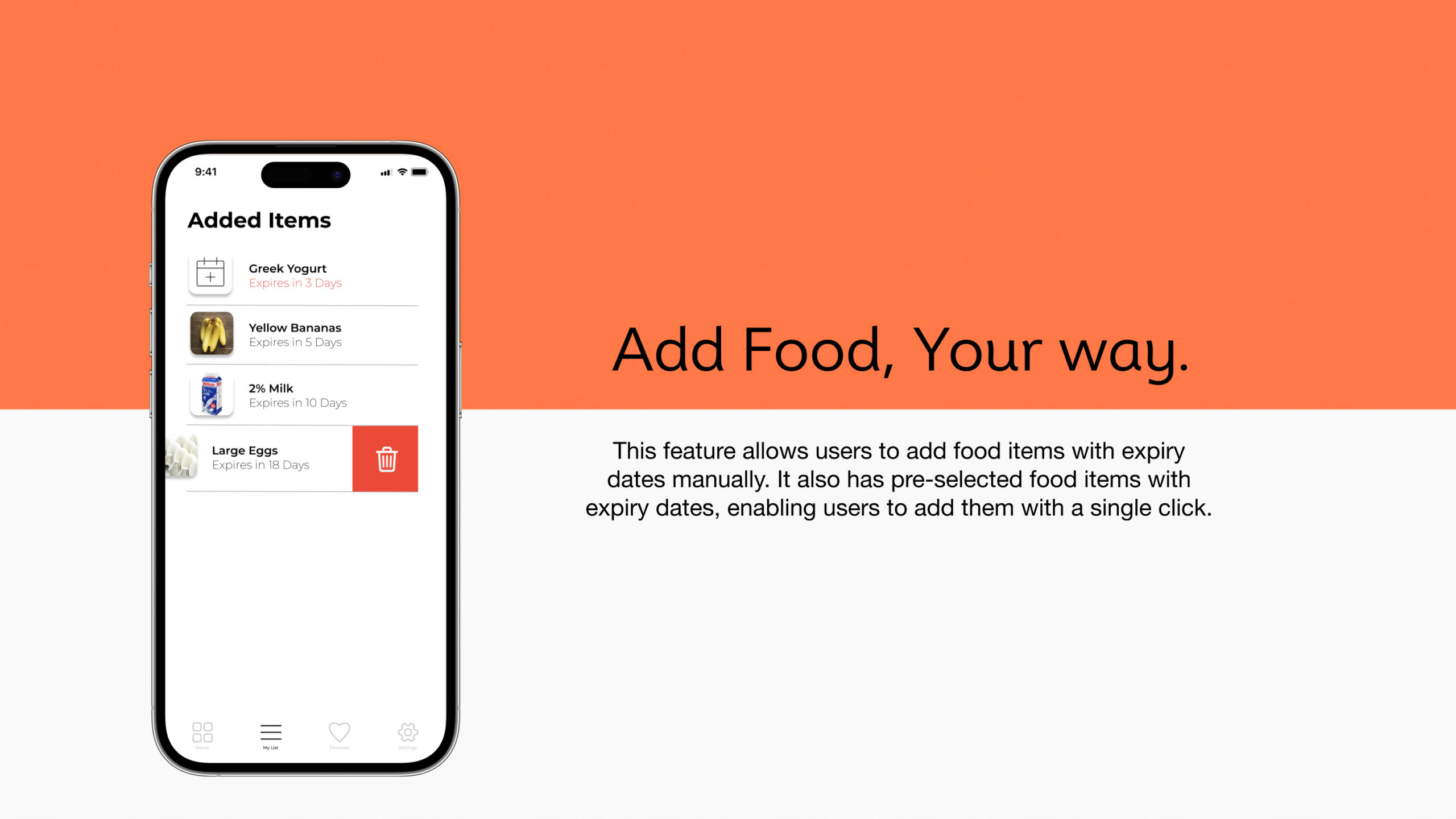
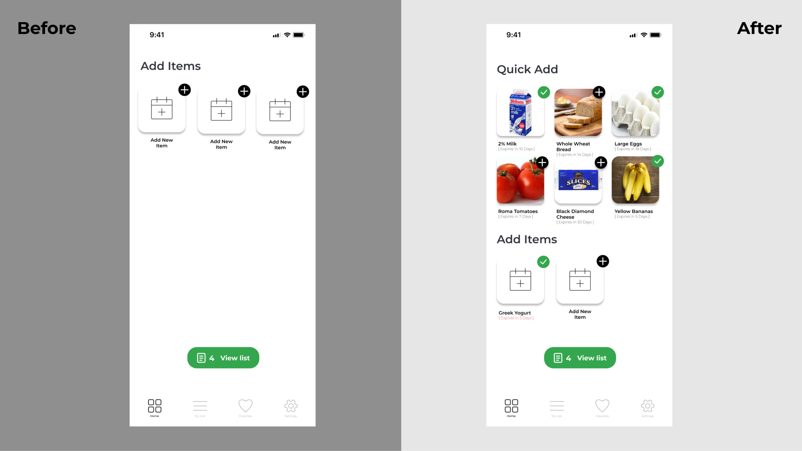
Quick Add Functionality: Users expressed a need for a more efficient way to add common food items, such as bananas, bread, milk, and eggs. A quick-add feature would streamline the process and save time.
Major Design Iterations
Based on the feedback from our usability study, we revised the app’s colour scheme. The original dark theme was replaced with a vibrant orange palette (HEX code: FE7240), creating a more visually appealing and energetic user interface.
In response to user feedback, we introduced a quick-add feature. This allows users to rapidly add common food items, such as milk, eggs, and bread, with pre-set expiration dates, streamlining the process and saving time.
What I Learned & What’s Next
This project taught me an invaluable lesson: Good design isn’t just about aesthetics—it’s about solving real problems.
Through user research, iterative design, and usability testing, I built an app that not only looks great but actively improves lives.
Next? I’m excited to continue creating impactful, user-centric digital solutions that make everyday experiences smarter, smoother, and more meaningful.